BRAND UPDATE
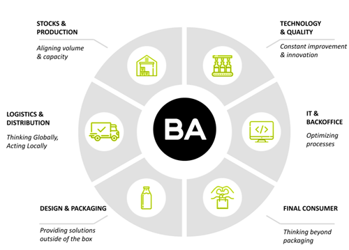
With innovation and proximity to clients as key factors in its strategy, BA continues to invest in new product development for the food and beverage industry.
Thus, as partner of its clients. BA seeks to understand the market dynamics and satisfy and even surprise customers with increasingly appealing products.
BA wants to take this partnership with its clients even further and analyse the entire value chain with them, seeking opportunities for improvement and to reduce the environmental impact.
With this purpose in mind, BA developed a program called "Challenging Innovation" with its main clients, intended to create opportunities for innovation. BA intervenes in the supply chain, optimizing resources, obtaining a cost reductions and sharing the value created.







CHALLENGE TO INNOVATION WITH CLIENTS
CASE STUDIES
WARRE'S WARRIOR
Product:
Warrior is the oldest Port Wine brand and has been used by the house of Warre continuously since the mid XVIII century. Consequently, it is one of the most emblematic Port Wine brands of the Warre house and has a strong presence in the British, north American and northern-European markets. It is a Reserve Port of high quality and comes from the Warre vineyards, particularly Quinta da Cavadinha and Quinta do Retiro Antigo.
Objective:
Relaunch the wine with a new image. Warrior is in a ’special product’ segment (the Reserve) with highest sales, but also extremely competitive. Thus, to face the market challenges (especially in large supermarkets) and increase sales, we decided to relaunch this wine with a new image. This new image lead to a complete and full renovation not only of our bottle label, but also the other components of our product packaging, such as the bottle, the capsule etc.
MONDARIZ
Product:
Água de Mondariz is a company dedicated to bottling and commercialization of natural mineral water. It is a market leader in the northwestern peninsula and is present in 29 countries and four continents.
Objective:
In order to adapt to international market standards, Águas de Mondariz bet on two glass packaging formats: a 750 ml bottle and a 330 ml bottle. Additionally, Águas de Mondariz chose clear glass for its still water and green glass for sparkly water, a change that recovers the former product bottle distinction and is in accordance with the international color codes for sparkly water.
FRIZE
Product:
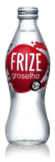
Frize was launched in June 1994 as 100% pure sparkly water brand and from the beginning was placed as a natural and refreshing product, intended for people who want to drink it, not for people who have to take it. In 2002 the brand expanded to flavored water, launching lemon Frize that was a great success and in the following years new flavors were added.
Objective:
Frize decided to change its bottle and packaging in 2007 to adopt a more modern, youthful and irreverent look that was more adequate for the brand’s image.
RADICAL - PEPSICO
Product:
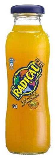
Radical: A non-carbonated drink launched in Spain in 1995. Classified as a ’new Age’ beverage when launched, this was a revolutionary product due to its natural concept, with high percentage of fruit juice and simultaneously refreshing. Five flavors are now bottled: orange, lemon, wild berries, Activ and Orange Activ.
Objective:
In 2009 the product was launched with a design by Morera Design. With curvy but ergonomic shape, and intended to stand out for its practical shape rather than its complex form. Its PSL label contributes to a innovative and modern look.
CAMPILHO
Product:
Água Campilho has always been recognized by its unique properties, its origin, its naturalness and its quality.
Objective:
Respecting tradition, we highlight and value the distinct characteristics of Água Campilho, modernizing its image and packaging, as noble as its origins.
ORLANDO
Product:
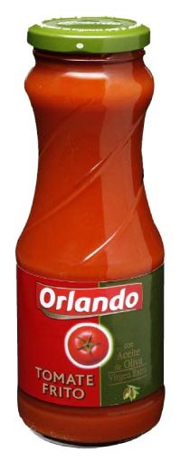
Orlando is a leading brand of fried tomato in the Spanish market. It offers customers’ products made with natural, high quality ingredients, where 35 years of experience is combined with the guarantee of the world’s leading tomato processing company.
Objective:
To offer customers a more modern, ergonomic and easy to use bottle that reflects Orlando quality.
AQUAREL - NESTLÉ WATERS
Aquarel
The new Água Aquarel, Nestlé bottle.
OLIVEIRA DA SERRA
Product:
A great olive oil is the secret of a great recipe. Portuguese eating habits have changed and Oliveira da Serra changed with them. The brand has grown and its position is now more urban, cosmopolitan and seductive. This change illustrated by a more ergonomic and elegant bottle, a new logo and a new communication system give the brand its own style, and a friendlier one. This new range of products reinforces the brands position. Each type of olive oil has a unique personality corresponding to a particular flavor and usage. All these changes make Oliveira da Serra a more recognized and sensual brand without loosing its original tradition.
AQUARIUS - COCA-COLA
Product:
Aquarius is an active drink, healthful and revitalizing rich in minerals and without gas. It is available in 2 flavors (lemon and orange) with a soft color and a pleasant and cooling flavor. Aquarius is a drink that restitutes minerals and liquidslost daily. It is the drink for who takes the life as a sport!
Objective:
The launching of Aquarius in this glass packing, manufactured for the BAVidro for the Coca Cola Company, allows to catch the chance of consumption of this drink in a market key as it is the Horeca Canal. It is a special and attractive packing. The packaging, a very elegant bottle, that gives great prominence and quality to the product.
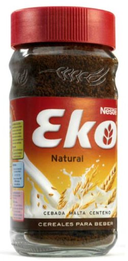
EKO - NESTLÉ
Product:
Eko Natural is a mix of natural and healthy cereals to have with milk. The excellent cereal nutritional qualities (barley, malt and rye) together with the Eko milk qualities provide you carbohydrates, phosphorus, magnesium and calcium, necessary to a balanced meal.
Objective:
Eko re-launch.
CARLSBERG - UNICER
Product:
Carlsberg was the first brand associated to the Euro 2004 hosted in Portugal. Because of this event’s importance and the need to maintain a leading position in a dynamic beer market, Unicer reinforced its investment in the brand in that year. Carlsberg’s indisputable leadership in the premium segment justified an attractive and innovative bottle to distinguish the brand even further and to enhance its appeal to consumers.
Objective:
The Carlsberg Euro 2004 33 cl TP bottle stands out for the embossed engraving of a ball whose effect is enhanced through a label and back label in transparent plastic (PSL). In addition to the goal of higher sales, Carlsberg also wanted to create a strong link to the sports event and to appeal to consumers by emphasizing their enthusiasm for football.
